seojeek

Alex Vallejo, senior software engineer

Gallery · Room 08 · France and beyond, 1925–1930s

Art Deco posters

Travel posters of the machine age: liners, mountains and lettering cut like stone.
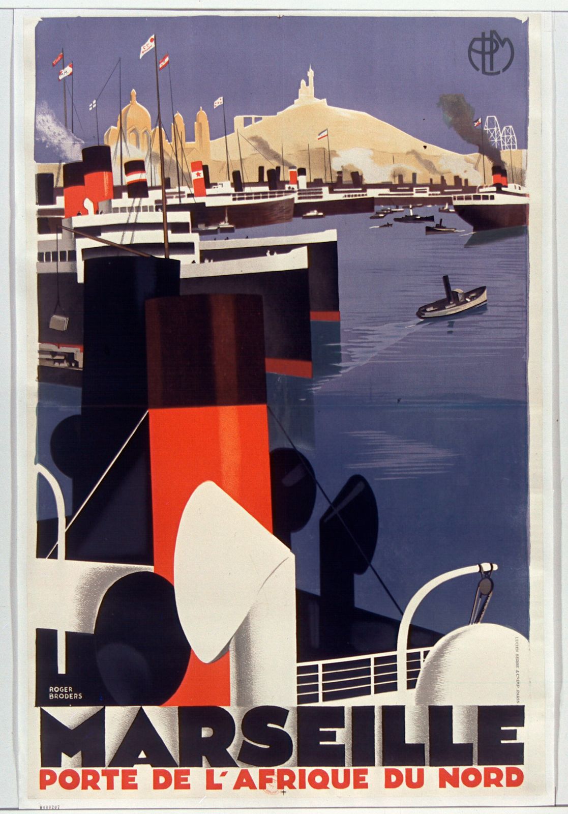
A towering red-and-black ship's funnel in the foreground, with liners and the hilltop basilica of Marseille behind, above the word MARSEILLE.

Roger Broders

Marseille, Porte de l'Afrique du Nord, c. 1929

Color lithograph

Victoria and Albert Museum, London · View record ↗

Public domain, via Wikimedia Commons

Wall text

Art Deco takes its name from the Exposition internationale des arts décoratifs et industriels modernes, held in Paris from April to October 1925. Antoine Bourdelle designed its official poster. The label itself came much later: it first appeared in print in 1966 and caught on as a style name in 1968.

The style stood for luxury, glamour and faith in technical progress, combining bold geometry with the look of the machine age. Posters were its street-level form. Railways and shipping lines hired poster artists to sell travel, and they turned locomotives, liners and resorts into simple, monumental shapes.

Roger Broders made posters for the Paris-Lyon-Méditerranée railway, from the mountains around Chamonix to the Mediterranean coast. His Marseille poster crops a liner's funnel so close that it becomes pure geometry. The most famous Deco poster artist, A. M. Cassandre, is still in copyright, so his Étoile du Nord and Normandie are not shown here.
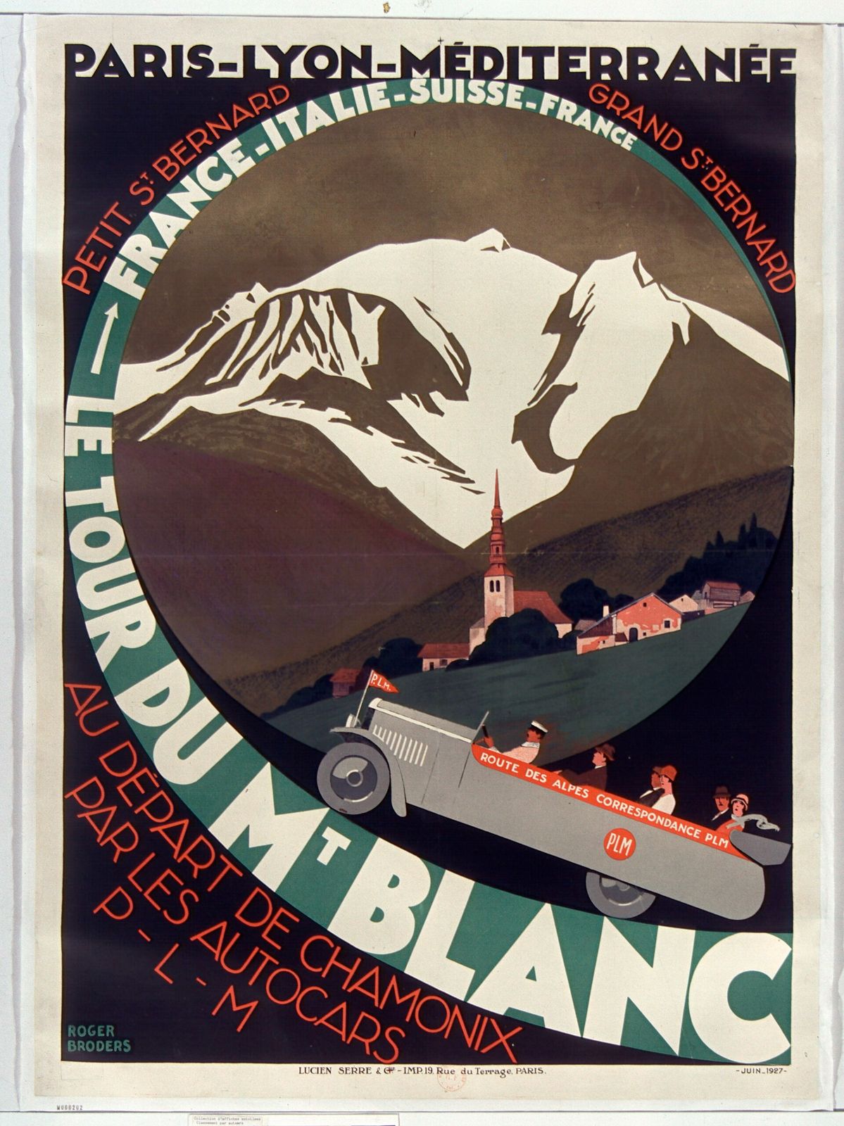
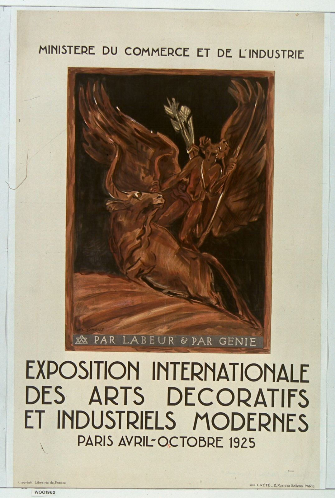
Palette · Sampled from the works shown

  • Funnel red

    #E34125

  • Deep navy

    #3C4461

  • Dusk violet

    #76718F

  • Bronze brown

    #5D311D

  • Poster cream

    #E4DDCA

How to recognize it

  • Bold, simplified shapes with crisp edges and flat color

  • Low or close viewpoints that make machines monumental

  • Geometric, often all-capital lettering built into the image

  • Strong silhouettes that read from across a street

More works

What to borrow

  1. 01

    Crop close. A detail at huge scale, like a liner's funnel, says more than the whole object.

  2. 02

    Build the headline into the picture. Lettering that shares the image's geometry looks designed, not added.

  3. 03

    Simplify to flat shapes and a few colors so the message reads from across the street, or across a small screen.